Toronto’s urban tapestry is a vibrant, ever-changing mosaic of culture, commerce, and community. With significant new investments continually reshaping its iconic skyline and internal spaces, the demands on design and construction are more rigorous than ever. To successfully de-risk projects, optimize delivery timelines, and ensure long-term value in this dynamic environment, a robust foundation in human-centered interior branding and signage design is not merely an advantage; it is an absolute necessity. This comprehensive blog post serves as your definitive guide, offering an in-depth checklist designed to ensure unparalleled compliance, quality, and user experience in your Toronto interior branding and signage projects throughout 2025 and beyond.
The complexity of modern building projects, particularly in a metropolitan hub like Toronto, requires a forward-thinking approach. From initial conceptualization to final installation, every element must be meticulously planned and executed. Our insights stem from extensive experience, recognizing that successful projects are those that prioritize the end-user while seamlessly integrating brand identity and adhering to stringent regulatory frameworks. This guide is crafted to empower developers, architects, interior designers, and project managers with the knowledge to navigate Toronto’s specific requirements, ensuring your spaces are not only aesthetically pleasing but also intuitively functional and fully compliant.
Why Human-Centered Interior Branding and Signage Design Matters in Toronto’s Dynamic Landscape
In a city as bustling, diverse, and rapidly growing as Toronto, the importance of clear, intuitive, and empathetic design cannot be overstated. Human-centered design places the individual at the heart of the design process, creating spaces that are inherently more accessible, efficient, comfortable, and ultimately, more enjoyable to navigate. This approach transcends mere aesthetics; it is about crafting environments that anticipate needs, reduce friction, and foster positive emotional connections with the space and, by extension, the brand it represents.
Enhancing Accessibility and Inclusivity
Toronto’s demographic richness demands an unwavering commitment to inclusivity. A human-centered approach ensures that spaces are usable by people of all ages, abilities, and cultural backgrounds. This goes beyond basic AODA compliance, delving into considerations like multilingual signage, universally recognized iconography, clear sightlines for those with visual impairments, and tactile cues for the visually impaired. Inclusive design isn’t just a regulatory checkbox; it’s a moral imperative that significantly broadens the usability and appeal of any given space, reflecting Toronto’s commitment to diversity.


Boosting Efficiency and Reducing Stress
Think about the stress caused by getting lost in a large hospital, an unfamiliar office complex, or a sprawling retail center. Poor wayfinding leads to wasted time, frustration, and a negative perception of the environment. Human-centered signage systems guide users effortlessly, minimizing cognitive load and allowing them to focus on their primary purpose within the space. In a commercial context, this translates to increased foot traffic efficiency, better customer satisfaction, and improved operational flow. For critical public services, it can literally save lives by ensuring quick access to emergency exits or essential departments.
Strengthening Brand Identity and Fostering Positive Impressions
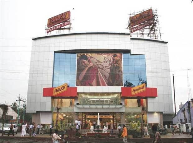
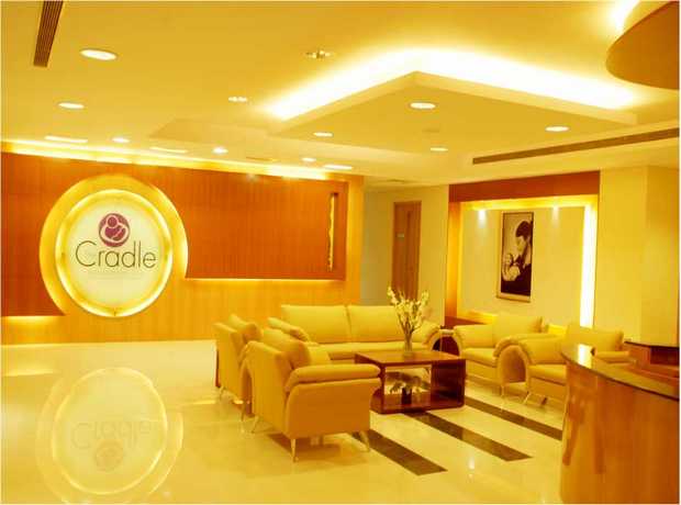
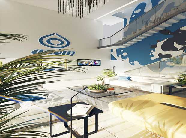
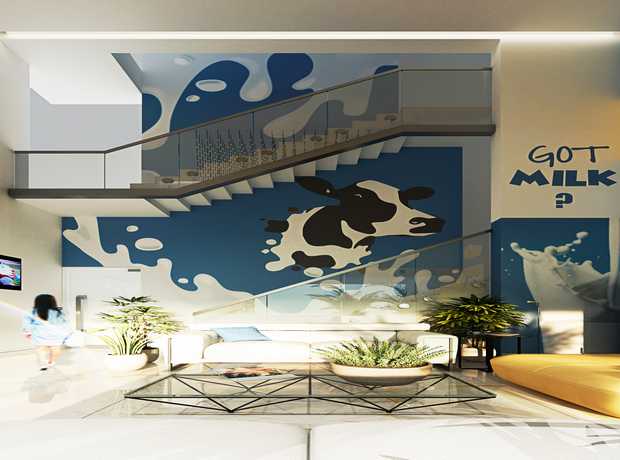
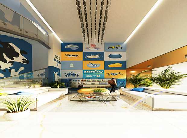
Interior branding and signage are powerful storytelling tools. They are physical manifestations of a brand’s values, personality, and promise. When designed with a human-centered lens, signage subtly reinforces brand identity, creating a cohesive and memorable experience. High-quality, thoughtfully designed signage communicates professionalism, attention to detail, and a commitment to user well-being. This fosters trust, enhances corporate image, and leaves a lasting positive impression on visitors, clients, and employees alike. It transforms a mere building into a recognizable and cherished brand experience.
Mitigating Risks and Accelerating Project Delivery
With new investments flowing into Toronto, robust human-centered interior branding and signage design will be essential to de-risk and deliver faster. Early integration of human-centered principles into the design process helps identify potential issues related to compliance, usability, and integration before they become costly problems during construction or post-occupancy. This proactive approach minimizes reworks, avoids delays, and ensures that projects stay on schedule and within budget. Skydome Designs has delivered 2294+ human-centered interior branding and signage design assignments across Toronto and globally over 12+ years. On‑time delivery 99%, multi‑disciplinary reviews, and post‑occupancy support underpin outcomes, significantly de-risking your projects. Contact us to learn more about human-centered interior branding and signage design in Toronto and how our proven expertise can benefit your next project.
Comprehensive Checklist for Human-Centered Interior Branding and Signage Design in Toronto (2025)
This exhaustive checklist is meticulously crafted to cover every critical area when planning, designing, fabricating, and implementing interior branding and signage in Toronto. Adhering to these guidelines ensures not only regulatory compliance but also the highest standards of quality, functionality, and user satisfaction.
1. Regulatory Compliance: The Non-Negotiable Foundation
Navigating the complex web of regulations in Toronto is paramount. Non-compliance can lead to significant delays, hefty fines, and reputational damage. Our focus ensures your project is legally sound and ethically responsible.
- Accessibility Standards (AODA – Accessibility for Ontarians with Disabilities Act): This is perhaps the most critical component in Toronto. All signage must meticulously meet AODA requirements under the Integrated Accessibility Standards Regulation (IASR).
- Tactile Characters and Braille: Ensure all permanent room identification signs, directional signs, and informational signs that are not temporary or directional to publicly available information have raised characters and Grade 1 Braille. Characters must be sans-serif, uppercase, between 16 mm and 50 mm high, and raised 0.8 mm. Braille must be positioned directly below the corresponding tactile characters.
- Color Contrast: Maintain a minimum contrast ratio of 70% between characters/symbols and their background. This often translates to light characters on a dark background or vice-versa.
- Non-Glare Finish: All sign surfaces must be non-glare and matte to prevent visual obstruction for individuals with visual impairments.
- Mounting Heights and Location: Tactile and Braille signs must be mounted on the latch side of doors, with the baseline of the Braille between 1200 mm and 1500 mm above the finished floor. Ensure clear floor space in front of the sign for easy access.
- Pictograms: When pictograms are used (e.g., washroom symbols), they must be accompanied by textual descriptions below them, with the text following AODA tactile and Braille requirements.
- Clear Path of Travel: Ensure signage does not obstruct accessible pathways, doorways, or exits.
The overarching goal of AODA is to make Ontario fully accessible by 2025, meaning adherence to these standards is not optional but a fundamental aspect of responsible design.
- Building Codes (Ontario Building Code – OBC): The OBC, including local Toronto amendments, dictates various aspects of interior signage.
- Fire Safety Signage: This includes emergency exit signs, egress path markings, fire extinguisher identification, and assembly point signs. These must comply with specific illumination requirements (e.g., self-luminous or internally illuminated), size, legibility, and material fire ratings.
- Occupancy Load Signs: Where applicable, signs indicating maximum occupancy must be clearly displayed.
- Material Fire Ratings: Any materials used for signage, especially large installations, must meet the required flame spread and smoke development ratings as per the OBC, particularly in public corridors or exit routes.
- Mounting and Structural Integrity: Large or heavy signs must be securely mounted according to structural engineering guidelines to prevent falling hazards.
- Wayfinding for Emergencies: Ensure that standard wayfinding does not conflict with or obscure emergency wayfinding elements, providing a clear and unambiguous path during emergencies.
Consultation with certified building code professionals early in the design phase is highly recommended for complex projects.
- Fire Safety Standards (NFPA & Local Bylaws): Beyond the OBC, specific fire safety standards are crucial.
- Emergency Egress Path Markings: Photoluminescent strips or signs for low-level egress paths can be required in certain building types, providing guidance in power outages.
- Sprinkler and Standpipe Identification: Clear signage for fire suppression equipment rooms.
- Electrical Safety: All illuminated signage must comply with Canadian Electrical Code (CEC) standards and be installed by licensed electricians.
- Combustible Materials: Careful selection of signage materials to prevent them from contributing to fire load.
Collaboration with fire safety engineers is critical to integrate signage into the overall fire safety plan.
- Permitting (City of Toronto): Before any installation, obtaining the necessary permits from the City of Toronto’s Building Division is essential.
- Sign Permits: Required for many exterior signs, but also some interior signs depending on size, illumination, and impact on structural elements. Even minor interior structural changes for mounting can trigger the need for a building permit.
- Heritage Property Considerations: For buildings designated under the Ontario Heritage Act, additional permits and design approvals are required, ensuring signage respects the historical integrity of the structure.
- Documentation: Prepare detailed drawings, material specifications, engineering reports (if applicable), and site plans for submission.
- Timeline Management: Permit acquisition can be a lengthy process; factor this into your overall project timeline to avoid delays.
Navigating Toronto’s permitting process requires a thorough understanding of local bylaws. Partnering with experienced professionals like Skydome Designs, who are familiar with these local nuances, can significantly streamline this process.
2. Human-Centered Design Principles: Empowering the User Experience
Beyond compliance, truly exceptional signage anticipates user needs and intuitively guides them, transforming potentially stressful navigation into a seamless journey.
- Wayfinding: Develop a Clear and Intuitive System: Effective wayfinding is a cornerstone of human-centered design, akin to designing a conversation with the user.
- Hierarchical Information: Create a clear visual hierarchy, starting with major destinations (e.g., “Elevators,” “Reception”) and progressively narrowing down to specific room numbers or departments.
- Nodal Points & Decision Making: Strategically place signs at key decision points (e.g., elevator lobbies, intersections of corridors, entrances to large departments). Users should never feel lost or unsure which way to go next.
- Landmarks and Beacons: Integrate distinctive visual elements, architectural features, or specific brand elements as landmarks to help users orient themselves.
- Consistent Language and Iconography: Use consistent terminology and universally understood symbols throughout the space to minimize cognitive load. Avoid jargon.
- Proximal Cues: Ensure that directional information is provided well in advance of a turn or decision point, giving users enough time to react.
- Mapping and Digital Integration: Consider incorporating digital kiosks with interactive maps, particularly in large or complex facilities, allowing users to plot their own course.
The goal is to eliminate “dead ends” of information, ensuring a continuous and logical flow.
- Legibility: Maximizing Readability for All: A sign is useless if it cannot be read effortlessly.
- Typography Selection: Opt for clear, sans-serif fonts (e.g., Helvetica, Arial, Open Sans) as they are generally more legible for signage. Avoid overly ornate or condensed fonts.
- Font Size and Viewing Distance: Calculate appropriate font sizes based on typical viewing distances. A general rule of thumb is 25 mm of character height for every 3 meters of viewing distance for primary information, with adjustments for secondary information.
- Color Contrast Ratios: Strictly adhere to AODA’s 70% minimum contrast ratio, but aim for even higher contrast for optimal readability for all, including those with low vision. Black on white or white on black are highly effective.
- Letter Spacing (Kerning) and Line Spacing (Leading): Proper spacing prevents letters from blurring together or lines from merging, especially at a distance.
- Case Usage: Use title case or sentence case for better readability than all caps, which can make words appear as undifferentiated blocks. Tactile/Braille signs are an exception where all caps are often used for the tactile component.
- Lighting and Glare: Position signs to avoid direct glare from windows or light fixtures, which can wash out text and make it unreadable.
Legibility is not just about meeting a standard; it’s about enabling quick comprehension in a busy environment.
- Inclusivity: Designing for Toronto’s Diverse Population: True human-centered design in Toronto embraces its multicultural fabric.
- Multilingual Options: For areas with significant non-English speaking populations or international visitors, consider incorporating key information in multiple languages (e.g., French, Mandarin, Punjabi).
- Universal Pictograms: Rely on widely understood symbols and iconography that transcend language barriers (e.g., international accessibility symbols).
- Gender-Neutral Design: When applicable, use gender-neutral symbols for facilities like washrooms to be inclusive of all gender identities.
- Low-Literacy Design: For environments serving diverse educational backgrounds, simplify language and increase reliance on intuitive visual cues.
- Neurodiversity Considerations: Avoid overly complex designs, flashing lights, or excessively vibrant colors that might be overwhelming for individuals with sensory sensitivities. Clear, calm, and predictable information is key.
Designing inclusively means designing for *everyone*, reflecting the values of a global city like Toronto.
- User Testing: Validating Design Effectiveness: The ultimate test of human-centered design is how real people interact with it.
- Pilot Programs/Mock-ups: Create prototypes or mock-ups of key signage elements and test them with diverse user groups before final fabrication.
- Walk-Throughs and Simulations: Conduct guided walk-throughs with participants (including individuals with disabilities) to observe their navigation paths and identify pain points.
- Surveys and Interviews: Gather qualitative feedback on clarity, aesthetics, and ease of use. Ask specific questions about where confusion arose.
- Eyetracking Studies: For critical areas, advanced eyetracking technology can reveal where users’ attention is drawn and if essential information is being missed.
- Iterative Design: Be prepared to refine and iterate on your designs based on user feedback. This iterative process is fundamental to human-centered design.
- Post-Occupancy Evaluation: Even after installation, monitor user behavior and gather feedback to identify areas for future improvement or maintenance adjustments.
User testing de-risks the project by ensuring the signage system truly works as intended for its target audience.
3. Branding and Aesthetics: Integrating Identity Seamlessly
Signage isn’t just functional; it’s a critical component of a space’s overall aesthetic and brand experience. It must speak the brand’s language visually and emotionally.
- Brand Consistency: Ensuring a Cohesive Identity: Signage is a tactile touchpoint of your brand.
- Visual Identity Guidelines: Adhere strictly to corporate brand guidelines, including specific color palettes (Pantone or CMYK values), approved font families, logos, and graphic elements.
- Tone of Voice: Ensure the messaging on signage reflects the brand’s tone – whether it’s formal, friendly, authoritative, or playful.
- Materiality: Select materials that resonate with the brand’s aesthetic and values (e.g., natural wood for an eco-conscious brand, sleek metal for a tech company).
- Spatial Integration: Signage should appear as an integral part of the interior architecture, not an afterthought.
This consistency builds recognition, trust, and a unified brand experience across all physical touchpoints.
- Visual Hierarchy: Guiding the Eye Purposefully: The effective arrangement of visual elements dictates how information is consumed.
- Size and Scale: Larger elements typically convey primary information, drawing immediate attention. Smaller elements provide secondary details.
- Color and Contrast: Use brand colors strategically to highlight key messages or differentiate sections. High contrast draws the eye more effectively.
- Placement: Position the most important information at eye level or in prominent sightlines.
- Grouping (Gestalt Principles): Group related information together visually (e.g., using a common background, frame, or proximity) to enhance comprehension.
- Whitespace: Ample negative space around text and graphics improves readability and prevents visual clutter.
A well-executed visual hierarchy makes complex information digestible and intuitive.
- Material Selection: Durability Meets Design: The choice of materials profoundly impacts both the aesthetic and longevity of signage, especially in high-traffic Toronto environments.
- Durability: Opt for materials resistant to wear, impact, scratching, and fading. Acrylic, aluminum, stainless steel, high-pressure laminates, and tempered glass are common durable choices.
- Aesthetics: Materials should complement the overall interior design scheme, contributing to the desired ambiance (e.g., warm wood for a natural feel, polished chrome for modern elegance).
- Maintenance: Consider how easily the material can be cleaned and maintained. Smooth, non-porous surfaces are often preferred in public or healthcare settings.
- Sustainability: Explore eco-friendly options such as recycled content materials, sustainably sourced wood, or materials with low VOC emissions, aligning with Toronto’s green building initiatives.
- Tactile Qualities: For certain applications (e.g., children’s areas or sensory pathways), consider materials with interesting textures.
- Cost Implications: Balance aesthetic desires with budget constraints, exploring various material grades and finishes.
The right material choice is a strategic decision that balances form, function, and longevity.
- Lighting: Enhancing Visibility and Atmosphere: Lighting can transform a sign from a functional object into a captivating design element.
- Illumination Type:
- Backlit: Creates a halo effect, often used for premium brands.
- Front-lit: Uniform illumination across the sign face.
- Edge-lit: A sleek, modern look where light travels through the material’s edge.
- Ambient Lighting: Ensure sufficient ambient light in the space so signs are visible without creating shadows.
- Accent Lighting: Use focused spotlights to draw attention to specific signs or features.
- Brightness and Contrast: Ensure illumination is bright enough for legibility without causing glare.
- Color Temperature: Match the lighting’s color temperature (warm vs. cool white) to the overall interior lighting scheme for coherence.
- Energy Efficiency: Utilize LED lighting for energy efficiency and long lifespan, reducing maintenance and operational costs.
- Emergency Lighting Integration: For exit and emergency signs, ensure they are connected to the building’s emergency power supply.
Thoughtful lighting design ensures signs are always visible and contributes to the desired mood of the space.
- Illumination Type:
4. Quality and Durability: Ensuring Longevity and Value
Investing in quality for interior branding and signage is an investment in the long-term integrity and functionality of your space, reducing future costs and maintaining a professional image.
- Material Specifications: Precision in Selection: Beyond general material type, specific grades and finishes are crucial.
- Substrate Thickness: Specify appropriate thickness for rigidity and durability, especially for larger signs.
- Finish and Coating: Detail matte, satin, or gloss finishes, and specify protective coatings (e.g., anti-graffiti, UV resistance) for high-traffic or sun-exposed areas.
- Adhesive Strength: For applied graphics, specify commercial-grade adhesives suitable for the substrate and environmental conditions.
- Hardware Grade: Use high-quality stainless steel or brass hardware for mounting, ensuring corrosion resistance and structural integrity.
- Environmental Certifications: Prioritize materials with relevant environmental certifications (e.g., GREENGUARD, FSC) to support sustainable building practices.
Precise material specifications prevent premature wear and maintain aesthetic appeal.
- Fabrication Techniques: Craftsmanship in Production: The quality of fabrication directly impacts the final product’s appearance and lifespan.
- CNC Routing and Laser Cutting: Ensure precision cuts and intricate details.
- Printing Technology: Utilize high-resolution UV-stable printing for vibrant colors and resistance to fading.
- Engraving and Etching: For tactile signs or detailed graphics, ensure clean, crisp lines without rough edges.
- Paint and Finish Application: Specify professional-grade paint systems (e.g., automotive-grade paints) for durability and consistent color. Ensure multiple coats and proper curing.
- Quality Control: Implement rigorous quality control checks at every stage of fabrication to catch defects early.
Skilled fabrication ensures that the design intent is perfectly translated into a durable physical reality.
- Installation Standards: Securing the Investment: Proper installation is critical for safety, longevity, and aesthetics.
- Structural Integrity: Ensure signs are securely fastened to appropriate structural elements (e.g., studs, blocking) using the correct anchors and fasteners. Avoid relying solely on drywall.
- Alignment and Leveling: Install all signs perfectly level and plumb, ensuring consistency across multiple installations.
- Mounting Heights: Double-check mounting heights for compliance with AODA and building codes.
- Protection During Installation: Protect finished surfaces (walls, floors) from damage during the installation process.
- Electrical Connections: All illuminated signs must be connected by licensed electricians, adhering to CEC and local Toronto electrical bylaws.
- Accessibility During Installation: For complex installations, ensure adequate space and access for installers, potentially requiring lifts or scaffolding.
Professional installation protects your investment and ensures safety for all occupants.
- Maintenance Plan: Preserving Value Over Time: Even the highest quality signage requires a proactive maintenance strategy.
- Cleaning Schedule: Establish regular cleaning protocols using appropriate, non-abrasive cleaning agents to prevent buildup and maintain clarity.
- Repair and Replacement Protocols: Have a plan for repairing or replacing damaged elements promptly to maintain functionality and aesthetic appeal. Keep spare parts for common elements.
- Digital Signage Updates: For digital screens, ensure software updates, content management, and hardware checks are performed regularly.
- Lighting Checks: Periodically inspect illuminated signs for burnt-out bulbs or faulty wiring.
- Budget Allocation: Factor long-term maintenance costs into the project budget to ensure ongoing quality.
- Vendor Support: Partner with suppliers who offer comprehensive maintenance contracts and readily available spare parts.
A well-executed maintenance plan guarantees that your signage continues to perform optimally and reflect positively on your brand for years to come.
Working with Toronto Interior Experts: Your Strategic Advantage
Navigating the intricate landscape of interior branding and signage design, particularly with Toronto’s specific regulatory and demographic considerations, requires a blend of deep expertise, local knowledge, and proven experience. Partnering with a reputable Toronto human-centered interior branding and signage design company can provide invaluable strategic advantages, ensuring your project not only meets all requirements but also surpasses expectations in terms of functionality, aesthetics, and user experience.
Skydome Designs stands as a beacon of excellence in this field. We have proudly delivered 2294+ human-centered interior branding and signage design assignments across Toronto and globally over 12+ years. Our on‑time delivery rate of 99%, coupled with multi‑disciplinary reviews, and dedicated post‑occupancy support, robustly underpins superior project outcomes. This extensive track record demonstrates our capability to handle projects of any scale and complexity, ensuring seamless execution from concept to completion. Our deep understanding of local bylaws, cultural nuances, and design trends specific to Toronto allows us to craft solutions that are both globally competitive and locally resonant.
Skydome Designs: Your Partner for Interior Excellence in Toronto
At Skydome Designs, we don’t just design spaces; we craft experiences. We understand the profound nuances of creating environments that are not only functional and compliant but also deeply inspiring and reflective of their purpose. Our comprehensive suite of services is designed to provide holistic solutions for diverse project needs:
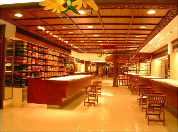
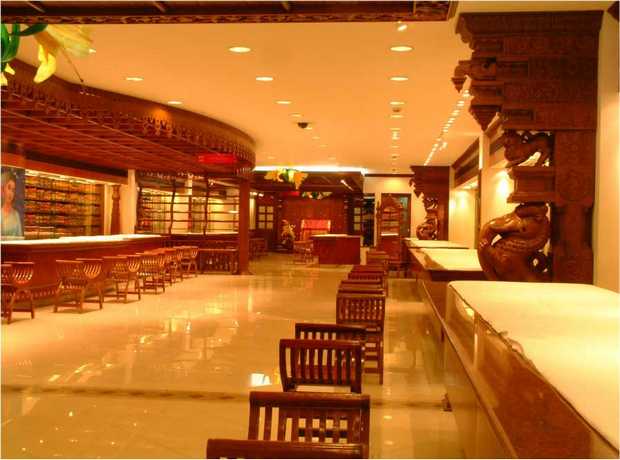
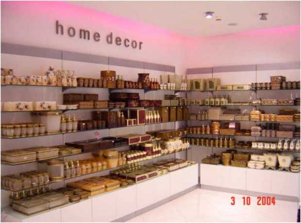
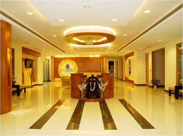
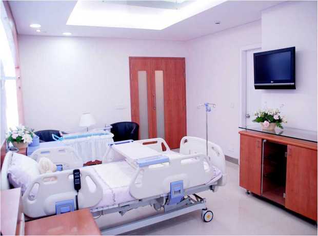
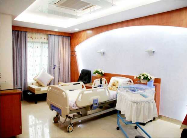
- Interior Design: We specialize in crafting innovative, sustainable, and award-winning interior designs across various sectors. From the critical and sensitive environments of hospitals and healthcare facilities to the inviting comfort of residential spaces and the dynamic appeal of retail environments, our designs prioritize human well-being, operational efficiency, and aesthetic excellence. We integrate the latest trends with timeless principles to create enduring spaces.
- Space Planning: Our expertise in space planning focuses on optimizing every square foot to enhance efficiency, flow, and user experience. We meticulously analyze movement patterns, functional requirements, and ergonomic considerations to create layouts that maximize utility while maintaining an open, accessible, and comfortable atmosphere. This strategic approach ensures seamless integration of branding and signage within the overall spatial narrative.
- Branding & Signage: This is where our human-centered philosophy truly shines. We develop comprehensive branding and signage solutions that go beyond wayfinding. Our designs reinforce brand identity, communicate core values, and significantly improve navigation through intuitive, accessible, and aesthetically integrated systems. We translate your brand story into tangible, visual elements that resonate with every visitor.
- Acoustics: Recognizing that sound plays a crucial role in overall comfort and productivity, we implement advanced acoustic solutions. Whether it’s reducing noise in a bustling office, ensuring privacy in consultation rooms, or enhancing the auditory experience in a retail setting, our acoustic designs create comfortable, focused, and productive environments that positively impact user experience.
With nearly 30 years of collective experience, our team brings unparalleled innovation, sustainability, and functionality to every project. We deliver spaces that are not only beautiful but also enhance experiences and operational efficiency. Skydome Designs boasts an award‑winning team, ensuring transparent costs through detailed breakdowns, and proactive milestone‑based reporting specifically tailored for projects in Toronto. Our BIM‑led coordination, rigorous value engineering, and stringent quality control processes are precisely tailored to meet the unique challenges and opportunities of the Toronto market. We are committed to delivering excellence that aligns with your vision and Toronto’s high standards.
Navigating Future Trends in Toronto’s Interior Branding and Signage (2025 and Beyond)
As Toronto continues its trajectory of growth and innovation, interior branding and signage design will also evolve. Staying ahead of these trends is key to ensuring your projects remain relevant and cutting-edge.
Integration of Digital Signage and Interactive Kiosks
The proliferation of digital screens offers unparalleled flexibility for messaging, real-time updates, and interactive wayfinding. In 2025, expect to see more seamless integration of digital signage with traditional static signs, providing dynamic information that can adapt to different times of day, events, or language preferences. Interactive kiosks with touchscreen maps and personalized navigation routes will become more common in large public and commercial spaces, allowing users to tailor their experience.
Hyper-Personalization and Contextual Wayfinding
Future trends may lean towards more personalized experiences, potentially leveraging mobile device integration (e.g., through apps or QR codes) to provide contextual wayfinding. Imagine a system that recognizes your preferred language, provides turn-by-turn directions directly to your meeting room, or highlights relevant services based on your profile, all while respecting privacy concerns.
Sustainable Materials and Practices
With Toronto’s strong focus on sustainability, the demand for eco-friendly signage materials will continue to grow. This includes recycled content, rapidly renewable resources, low-VOC finishes, and designs that facilitate end-of-life recycling. Designers will increasingly prioritize local sourcing to reduce carbon footprint and support the local economy.
Biophilic Design Integration
The concept of connecting occupants with nature will extend to signage. Expect to see materials like reclaimed wood, natural stone, or living walls integrated with signage elements, creating a sense of calm and well-being. Green walls featuring subtle integrated signage elements could become a distinctive feature.
Tactile and Sensory Signage Innovations
Beyond AODA minimums, innovations in tactile and sensory signage will provide richer experiences. This could involve varied textures, integrated soundscapes, or even scent elements in specific zones to enhance wayfinding and branding, especially for those with sensory sensitivities or visual impairments.
Staying abreast of these trends ensures that your interior branding and signage in Toronto are not just compliant and functional, but also future-proofed and capable of delivering exceptional user experiences for years to come.
Conclusion
The success of any interior project in Toronto hinges on a meticulous, human-centered approach to branding and signage design. By rigorously adhering to the comprehensive checklist outlined above—encompassing regulatory compliance, deeply empathetic design principles, strategic branding, and unwavering quality—you are not merely installing signs; you are investing in an intuitive, accessible, and positive experience for every individual who interacts with your space.
In a city as dynamic and diverse as Toronto, compromising on quality or neglecting the user experience is a missed opportunity. Instead, prioritize human-centered design for a lasting impact that enhances functionality, reinforces brand identity, and contributes positively to the urban fabric. Your commitment to excellence in interior branding and signage will differentiate your project, de-risk your investment, and ultimately, elevate the entire user journey.
Ready to transform your space with exceptional, compliant, and human-centered interior branding and signage? Look no further. Contact Skydome Designs today for a personalized consultation. With our award‑winning team, transparent costs, milestone‑based reporting, and unparalleled expertise in BIM‑led coordination, value engineering, and quality control tailored to Toronto, we are perfectly positioned to bring your vision to life. Call us at +91 7299072144 to discuss your specific project requirements and discover the Skydome difference.
Frequently Asked Questions (FAQs)
What are the key considerations for AODA compliance in signage design, and why is it so critical in Toronto?
Key considerations for AODA compliance are extensive and deeply integrated into human-centered design. They include mandatory tactile characters and Grade 1 Braille for permanent room identification and directional signs, ensuring a minimum 70% color contrast ratio between text and background, using non-glare finishes, and adhering to specific mounting heights and locations (e.g., Braille baseline between 1200 mm and 1500 mm from the floor). Pictograms must also have corresponding text descriptions. AODA is critical in Toronto because it is mandated by provincial law, aiming for an accessible Ontario by 2025. Non-compliance can lead to legal penalties, fines, and reputational damage, but more importantly, it prevents a significant portion of Toronto’s diverse population from independently navigating and utilizing spaces.
How can I ensure my signage is truly user-friendly and intuitive, especially in a complex building layout?
To ensure user-friendly and intuitive signage, focus on several key principles. First, develop a clear hierarchical wayfinding system with consistent terminology and iconography. Place primary directional signs at key decision points (e.g., elevator lobbies, corridor intersections) well in advance of the actual turn. Use universally understood symbols and minimize text where possible. Employ clear visual hierarchy with appropriate font sizes and high contrast for legibility. Most crucially, conduct user testing early and often, using mock-ups or prototypes with diverse user groups (including those with disabilities) to identify pain points and refine the design based on real-world feedback. Leveraging interactive digital maps can also significantly enhance navigability in complex spaces.
What types of materials are best suited for interior signage in Toronto’s varying indoor environments?
The best materials for interior signage in Toronto’s diverse indoor environments balance durability, aesthetics, and maintenance. Common choices include acrylic (versatile, lightweight, available in many colors and finishes), aluminum (durable, sleek, suitable for engraved or dimensional letters), stainless steel (premium, highly durable, corrosion-resistant), and high-pressure laminates (cost-effective, good durability, wide range of patterns). For sustainable options, consider recycled plastics, bamboo, or FSC-certified wood. In high-traffic areas, scratch-resistant and easily cleanable materials are paramount. For areas requiring tactile elements, photopolymer or engraved acrylic are excellent choices. The specific environment (e.g., hospital vs. retail) will further dictate optimal material selection.
How do I choose the right font and size for optimal legibility across different viewing distances?
Choosing the right font and size involves a few rules. Opt for clear, sans-serif fonts (e.g., Arial, Helvetica, Open Sans) as they are easier to read from a distance. Avoid overly decorative, condensed, or italicized fonts for primary information. For font size, a general guideline is 25 mm (1 inch) of character height for every 3 meters (10 feet) of viewing distance. This rule can be adjusted for secondary information. Ensure ample letter spacing (kerning) and line spacing (leading) to prevent words from blurring. High contrast between the text and background color (at least 70% contrast ratio) is essential. Finally, consider the lighting conditions; well-lit areas allow for slightly smaller fonts, while dim areas require larger, bolder text.
What is the process for obtaining signage permits in Toronto, and how can Skydome Designs assist?
The process for obtaining signage permits in Toronto typically begins with a thorough understanding of the City of Toronto’s Zoning Bylaws and Sign Bylaws. You’ll generally need to submit a permit application to the City’s Building Division, accompanied by detailed drawings, site plans, material specifications, and potentially structural engineering reports, especially for larger or illuminated signs. For heritage properties, additional approvals may be required. Skydome Designs significantly streamlines this process by leveraging our extensive experience with Toronto’s specific regulatory framework. We provide expert guidance on required documentation, ensure designs are compliant with all local bylaws and building codes, prepare detailed submissions, and manage the communication with city officials on your behalf, minimizing delays and ensuring a smooth, efficient permitting process from start to finish. Our familiarity with local nuances and requirements de-risks this crucial phase of your project.
Skydome Designs Pvt Ltd
+91 7299072144 | info@skydomedesigns.com
Specializing in hospital and healthcare interiors, residential, and retail projects in Toronto and globally.
Related Internal Links:
- Hospital Interior Design Services
- Residential Interior Design Solutions
- Retail & Commercial Design
- About Our Award-Winning Team
Outbound Authority References: